
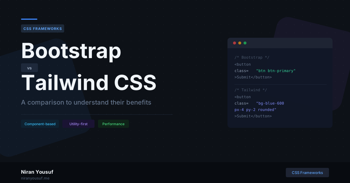
If you've spent any time in frontend development, you've used Bootstrap or at least heard of Tailwind CSS. Both are CSS frameworks, but they solve the same problem in fundamentally different ways. This post breaks down how each one works, where they shine, and how to decide which one belongs in your next project.
What Bootstrap Actually Does
Bootstrap is a component-based framework. It ships with pre-built UI components: navbars, modals, cards, dropdowns, and buttons, all styled and ready to use. You apply class names like btn btn-primary or card card-body, and you get a functional, styled component with almost no effort.
It also includes a 12-column grid system and a set of utility classes, but the core value proposition is those ready-made components.
<!-- Bootstrap button - styled out of the box -->
<button class="btn btn-primary btn-lg">Submit</button>

<!-- Bootstrap card component -->
<div class="card">
  <div class="card-body">
    <h5 class="card-title">Card Title</h5>
    <p class="card-text">Some quick content here.</p>
  </div>
</div>
You get a consistent, functional UI fast. The tradeoff is that it looks like Bootstrap, and everyone knows it.
What Tailwind CSS Actually Does
Tailwind is a utility-first framework. It doesn't give you components. Instead, it gives you low-level utility classes like flex, pt-4, text-gray-700, and rounded-lg, and you compose your own design directly in the markup.
There are no pre-styled buttons or cards. Everything you build is yours from the start.
<!-- Tailwind button - you compose the style yourself -->
<button class="bg-blue-600 hover:bg-blue-700 text-white font-medium px-6 py-2 rounded-lg transition">
  Submit
</button>

<!-- Tailwind card - fully custom -->
<div class="bg-white rounded-xl shadow-md p-6">
  <h5 class="text-lg font-semibold text-gray-800">Card Title</h5>
  <p class="text-gray-500 mt-2">Some quick content here.</p>
</div>
The result looks exactly how you want it to. The tradeoff is that it takes more thought upfront, and your HTML can get verbose.
The Core Philosophical Difference
This is the key distinction most comparisons miss:
- Bootstrap says: "Here's a button. Use it."
- Tailwind says: "Here are the tools to build your own button."
Bootstrap abstracts design decisions away from you. Tailwind hands those decisions back to you, with a structured system to make them.
Neither approach is wrong. They're built for different workflows and different types of developers.
Bundle Size and Performance
Bootstrap
Bootstrap's full CSS bundle is around 200KB unminified. Even minified, you're loading styles for components you may never use. You can customize the build to include only what you need, but it requires a proper Sass setup.
Tailwind
Tailwind uses PurgeCSS (built-in via its JIT engine) to scan your HTML and remove any unused utility classes at build time. A production Tailwind build typically comes in under 10KB, sometimes less.
In Tailwind v3, you define content paths in tailwind.config.js so the JIT engine knows which files to scan:
// tailwind.config.js (v3) - tell Tailwind which files to scan
module.exports = {
  content: ["./src/**/*.{html,js,jsx,php}"], // only keep classes used here
  theme: {
    extend: {},
  },
}
In Tailwind v4, this is no longer needed. Content paths are auto-detected, and there's no tailwind.config.js required at all. The whole setup is handled via a single CSS import:
/* main.css (v4) - this is all you need to get started */
@import "tailwindcss";
The end result is the same lean production build, but v4 removes the configuration overhead entirely.
Development Speed
Bootstrap
Fast for standard UIs. If you need a modal, a responsive navbar, or a form layout quickly, Bootstrap delivers in minutes. No design decisions needed. Just pick the component and customize the content.
Tailwind
Slower to start if you're new to it. You need to know the utility class names and think about the design yourself. But once you're fluent, the speed is comparable, and the output is more intentional.
Customization
Bootstrap
Customization requires overriding existing styles or going into the Sass variables. You're always working against the default design, which leads to specificity battles and messy CSS.
// Bootstrap customization - overriding defaults in _variables.scss
$primary: #7c3aed;
$border-radius: 0.75rem;
It works, but you'll eventually find yourself writing !important somewhere, which is a sign the framework is resisting you.
Tailwind
Customization is a first-class feature. You extend the theme with colors, spacing, fonts, and breakpoints, and those custom values become utility classes automatically.
In v3, this lives in tailwind.config.js:
// tailwind.config.js (v3) - extending the design system
theme: {
  extend: {
    colors: {
      brand: '#7c3aed', // now usable as bg-brand, text-brand, etc.
    },
    fontFamily: {
      sans: ['Inter', 'sans-serif'],
    },
  },
}
In v4, customization moves directly into CSS using the @theme block, with no JS config file needed:
/* main.css (v4) - define your design tokens in CSS */
@import "tailwindcss";

@theme {
  --color-brand: #7c3aed;   /* usable as bg-brand, text-brand, etc. */
  --font-sans: "Inter", sans-serif;
  --breakpoint-3xl: 1920px;
}
Both approaches give you the same result: a fully custom design system where your tokens become utility classes. v4 just makes it feel more native to CSS.
Responsive Design
Both frameworks handle responsive design well, but the approach differs.
Bootstrap uses a fixed set of breakpoints (sm, md, lg, xl, xxl) tied to its grid system.
Tailwind uses the same breakpoint prefixes but applies them to every single utility class:
<!-- Tailwind responsive - stacked on mobile, side-by-side on md+ -->
<div class="flex flex-col md:flex-row gap-4">
  <div class="w-full md:w-1/2">Column 1</div>
  <div class="w-full md:w-1/2">Column 2</div>
</div>
Tailwind's approach gives you more granular control without writing any media queries.
Learning Curve
Bootstrap has a lower barrier to entry. If you know basic HTML, you can build something functional in an hour by reading the docs.
Tailwind requires you to learn a new mental model. You need to know CSS well enough to understand what each utility does. Without a solid CSS foundation, Tailwind is frustrating. With it, Tailwind feels like a natural extension of how you already think.
When to Use Bootstrap
- Rapid prototyping where visual polish doesn't matter yet
- Internal tools, admin dashboards, or back-office UIs
- Projects where the team is not design-savvy
- Legacy projects already using Bootstrap
- When you need something functional in a day
When to Use Tailwind
- Client-facing projects with a custom design system
- Projects where you're working from a Figma design
- React, Next.js, or component-based projects
- Long-term projects where maintainability matters
- When you want full ownership of the design
My Take
I've used both in production. Bootstrap at WPPOOL for campaign landing pages years ago, and Tailwind more recently for component-heavy projects. The shift wasn't easy at first, but the two frameworks serve genuinely different needs.
Bootstrap gets you moving fast. Tailwind gives you full control. If your project has a custom design and long-term maintainability matters, Tailwind fits better. If you need something functional quickly and design isn't the priority, Bootstrap still does the job well.
The best framework is the one that fits your project's actual requirements, not the one that's trending.