CSS viewport height property unit

CSS viewport height property solves the issue of mobile display scrolling. When we work with CSS most of the time we use 100vh(viewport height) to display full viewport height content in the content section. Has anyone ever noticed when we use 100vh there is a lag on the mobile screen? Why is it like this?
Discussion about full height viewport UI in mobile phone
.banner {
    height: 100vh;
}
So, you must know that the address bar in the phone browser is visible on the display while scrolling down. But it disappears when scrolling up. As a result, if there is any important content at the bottom of the section, it is not always visible in the first load. After you scroll a little it shows up.

This issue is not in the desktop browser.
It happens because vh(css viewport height) is not counting this (address bar behavior) as an issue. It displays full height including the address bar. Whether it is showing or not.
Luckily we have a solution now. There are three new units in CSS: ‘dvh’, ‘svh, and ‘lvh’. We can use those to solve this problem.
Dynamic CSS viewport height unit “dvh”
.banner {
    height: 100dvh;
}
dvh (Dynamic viewport height) will be looking if this UI element is on the page or not. It will make them go away. It will take just the space needed when you scroll to the bottom and the address bar is showing in the display. Otherwise, it shrinks down and when you scroll up and the address bar disappears it will take up the space. But the element will shake a little bit. It’s not animating. Also when you are not in the section and you are scrolling up and down it happens. It is also annoying when it jumps in screen height.
Small CSS viewport height unit “svh”
.banner {
    height: 100svh;
}
svh (small viewport height) works best to solve the issue. Your phone screen won’t jump or shake with it. The reason for not jumping the content is because it’s taking a small version of the height. So, it always assumes the address bar element is opened at the top. Therefore, when you scroll the element no one knows the changes.
Large CSS viewport height unit “lvh”
.banner {
    height: 100lvh;
}
lvh (large viewport height) works the same as vh for the longer version. It just takes a longer version of the element. lvh works assuming that there are not (address bar behavior) any kind of thing on top of the page.
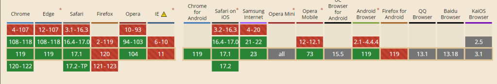
Browser compatibility
However, the solution and all browsers do not support ‘dvh’, ‘svh’, and ‘lvh’. The browser compatibility is shown in the image below.
The most effective way to write css viewport height
.banner {
    height: 100vh;
    height: 100dvh;
}
If the browser supports it, then the second line will always be prepared, and if the browser does not support it, then the browser will ignore the code of the second line as it is unknown to the browser, and the above code.